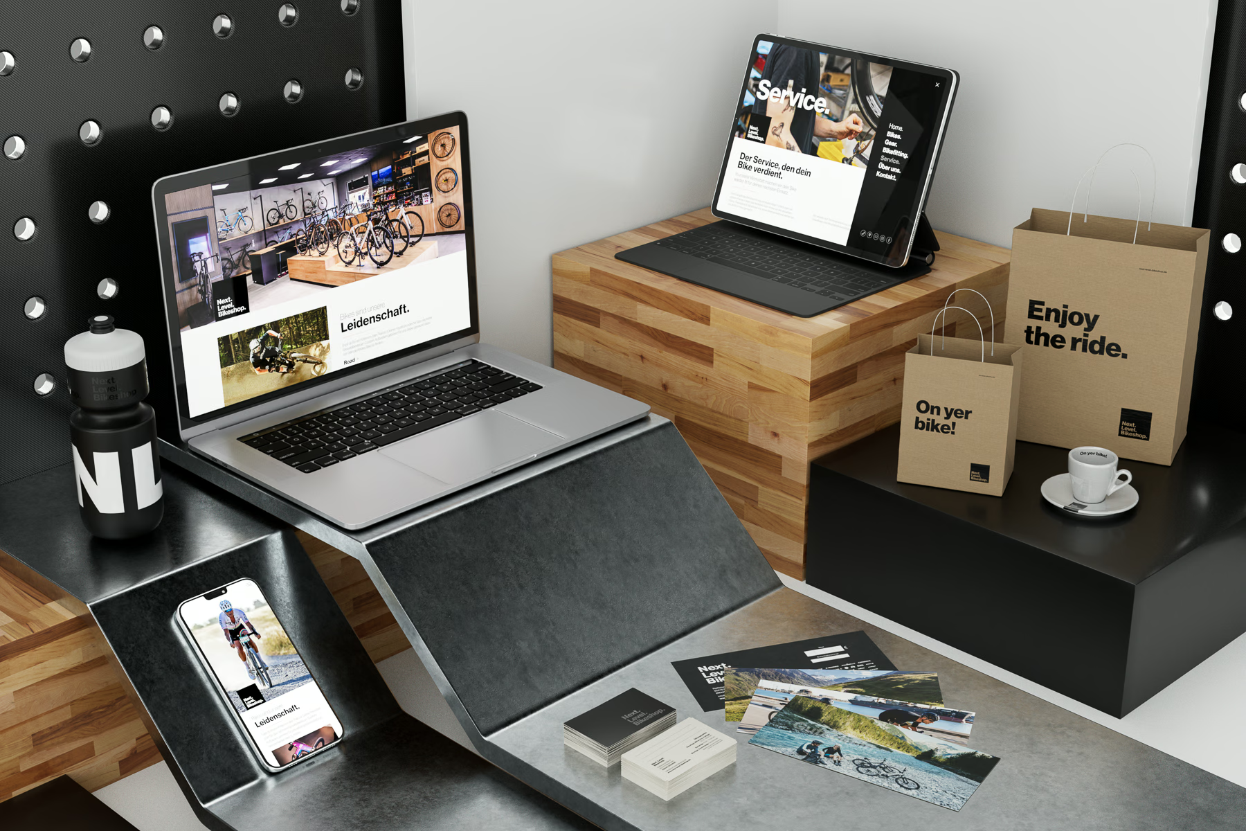
The branding needed to be simple, but strong and flexible. Bold, but not loud. A mark which is instantly recognised for quality, service, and passion.
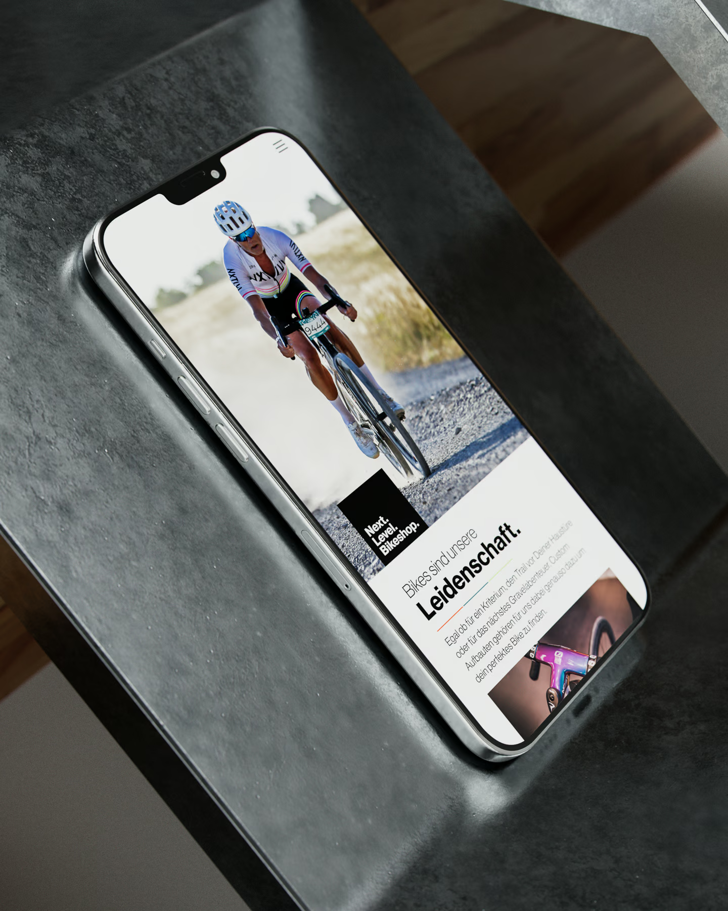
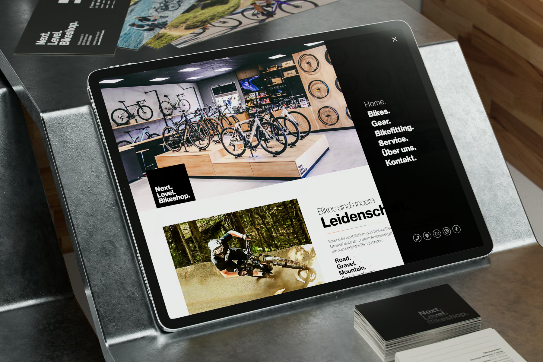
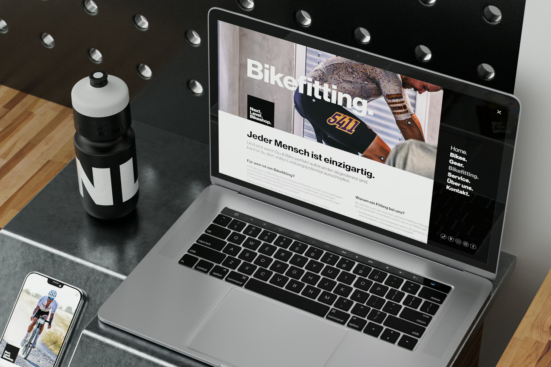
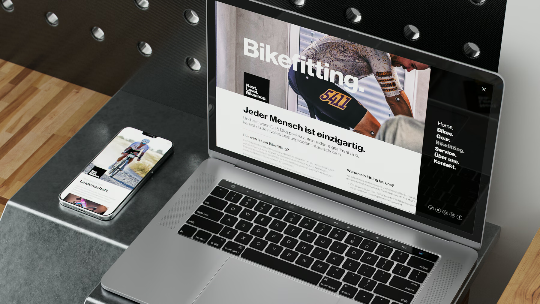
Armed with the logo, the typeface, and a minimalistic aesthetic, we crafted everything digital from the website through social media templates, to in-shop motion design loops.
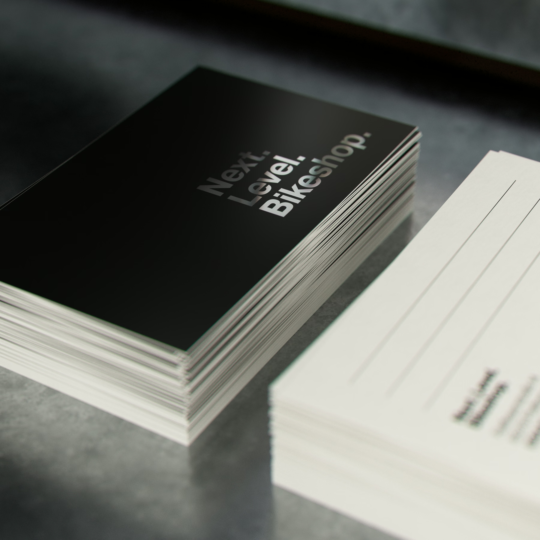
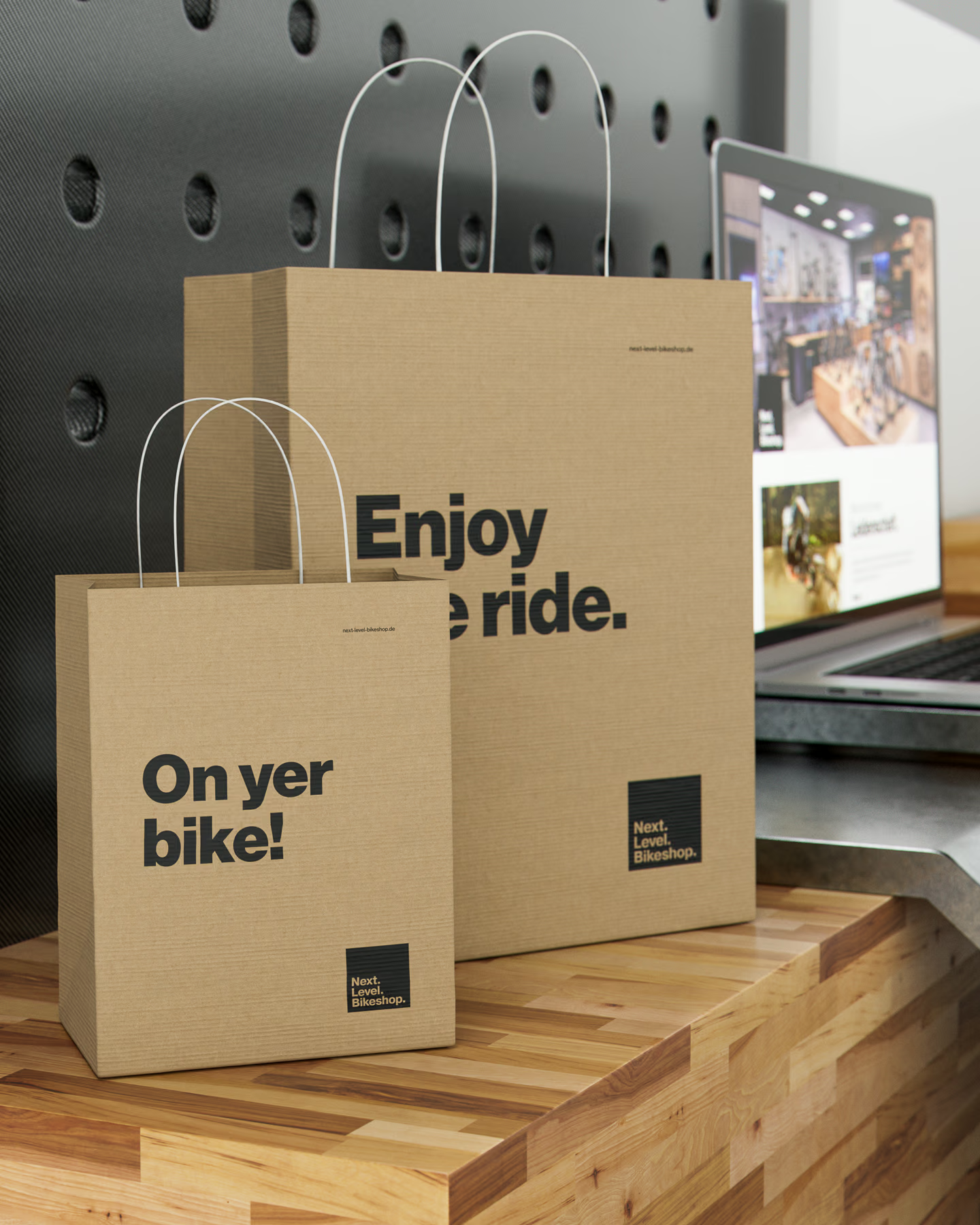
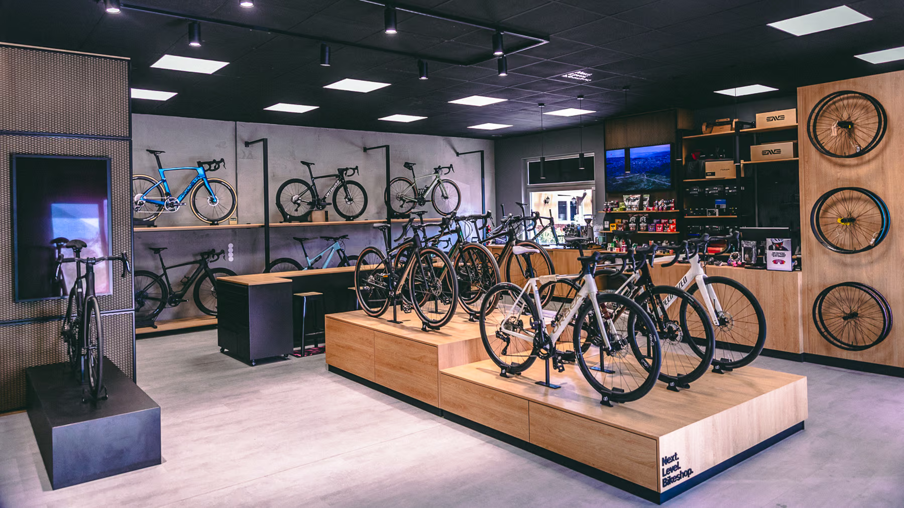
Printed items such as business cards, gift vouchers, and envelopes were created with subtle matte black finishes and spot varnish accents. These aesthetics were carried over to interior and exterior signage, including three-dimensional lit forecourt and building signage.
We further developed physical and tactile products from bags, essentials cases, T-shirts, and Bidons (water bottles), to a collaboration with Q36.5 on a range of cycling clothing for men and women — all of which sold out within a few weeks.
Shop Interior Photo: Christoph Meier


VIEW MORE LIKE THIS
