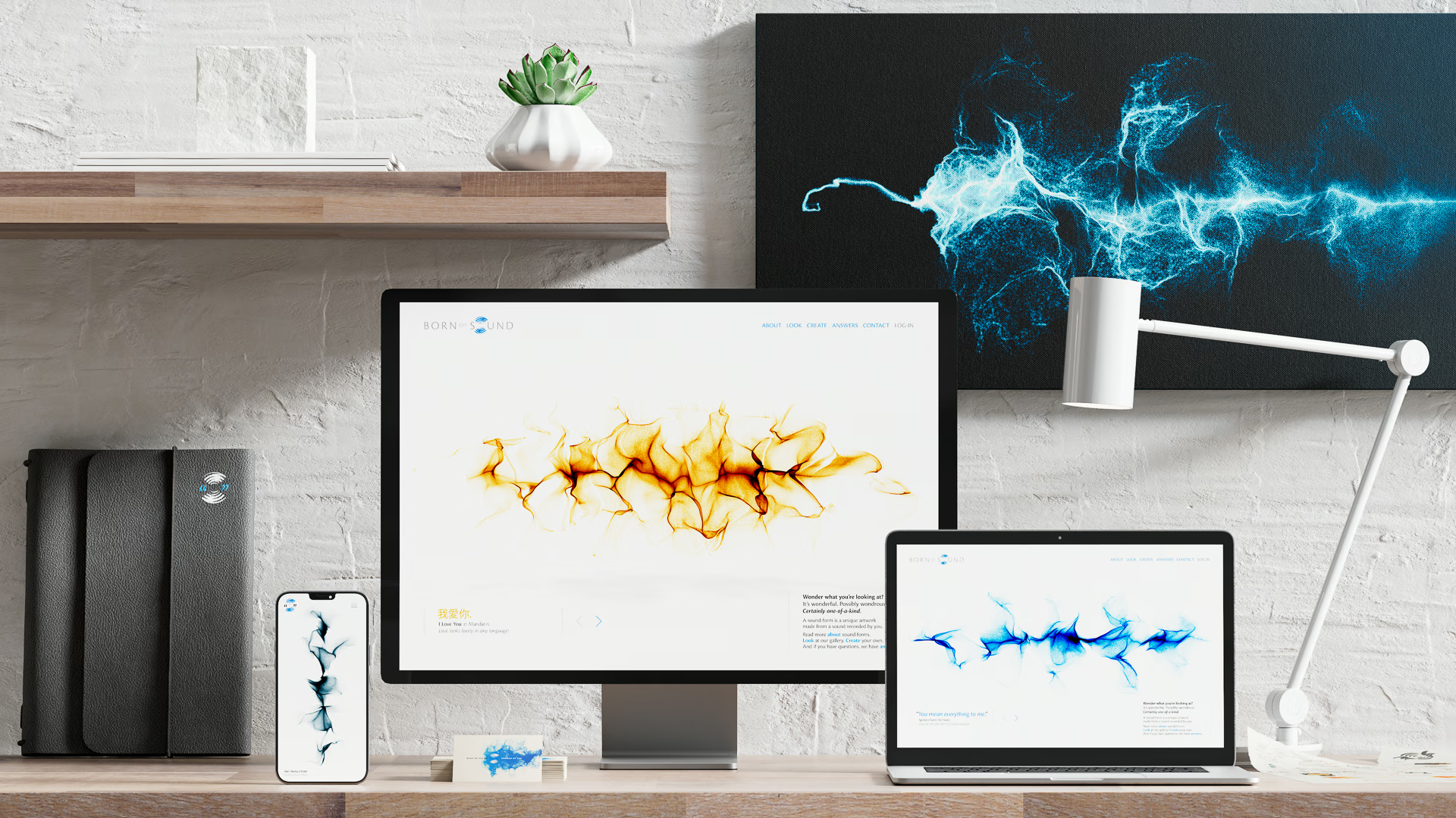

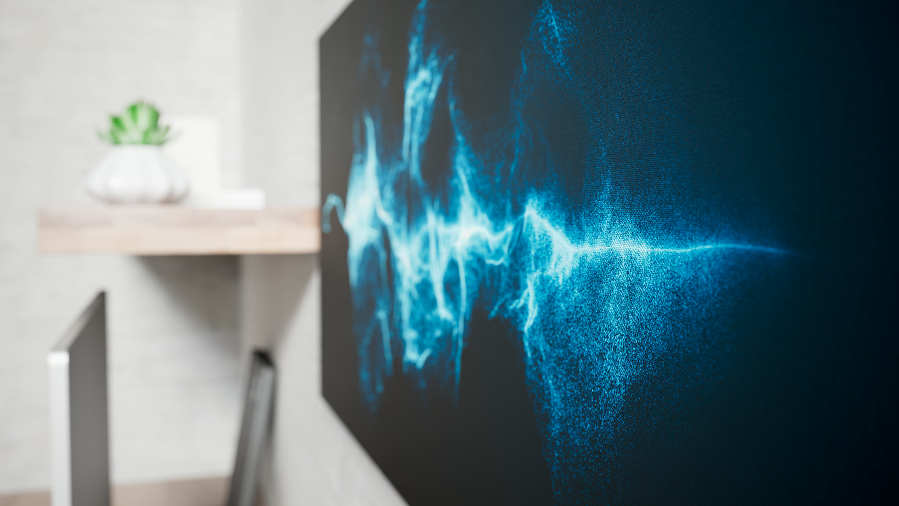
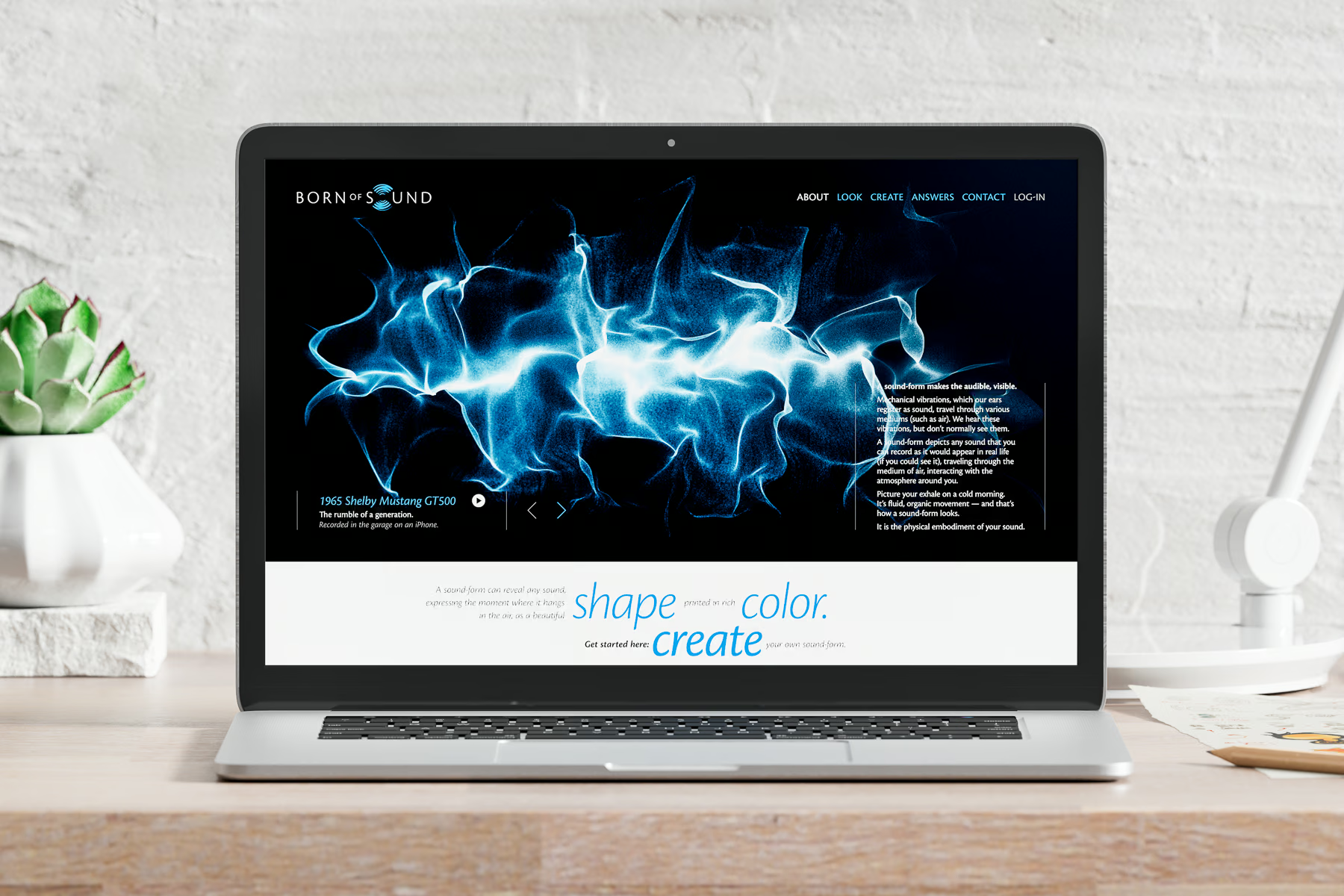
We first designed, developed, and programmed the digital technology for turning uploaded sound files into visual results — keeping in mind the high-resolution required for large-format digital printing.
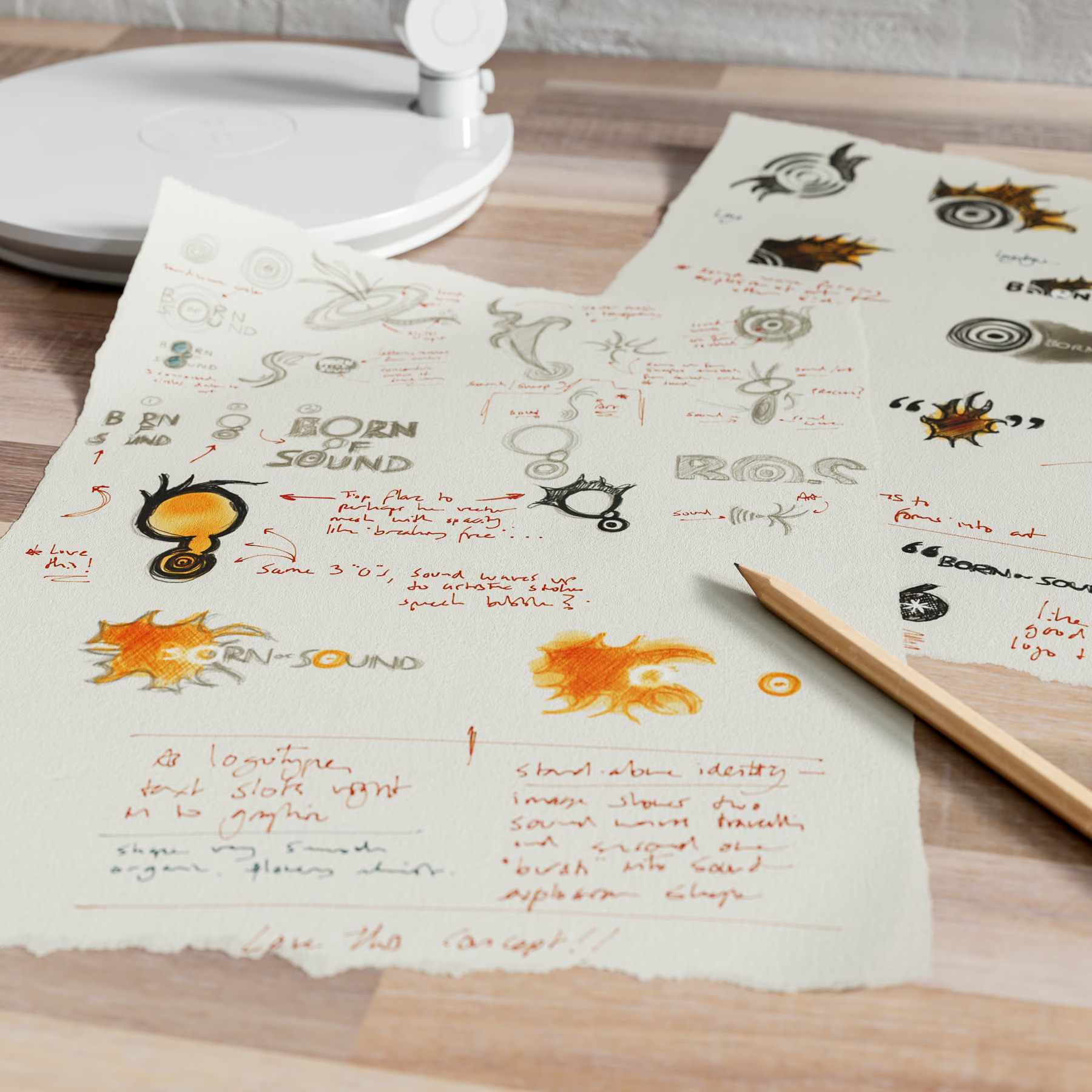
The brand identity took shape after hours of brainstorming and pages of sketches — the concept of a quote literally being a sound-wave was born.
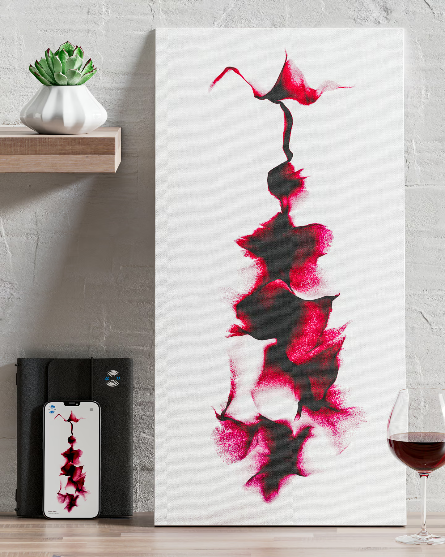
The website was designed and built using playful typography, with the sound-forms being the main focus and colour on the pages. Heavy, textured business cards were created, with the sound-form wrapping around from the back to the front side.
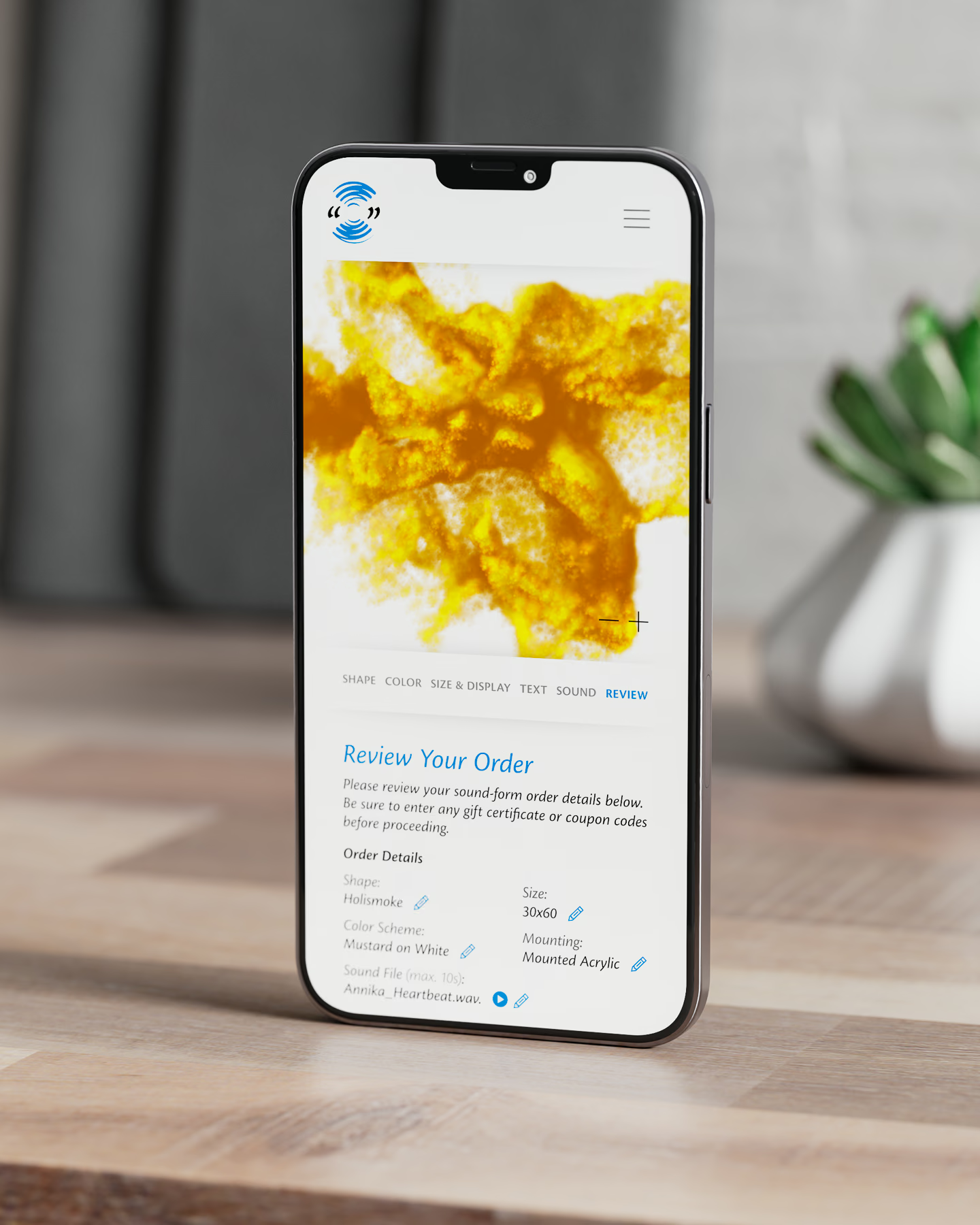
The eCommerce back-end platform allowed the customer to upload and preview their sound files, choose different visual rendering styles and colours, select size and mounting style, and order their finished sound-form in one easy process.


Site Copy: Alyson Kuhn

VIEW MORE LIKE THIS